
GETTING STARTED
After the brief were given by my lecturer, I have a feeling of strong eagerness and very anthusiastic on this assignment. As a rookie graphic designer for years, I'm still unable design a logo/monogram that can satisfy myself. So this will be good chance for me to design a monogram for myself using two initials that could also represent my personality at the same time, all thanks to my lecturer for some tips and guidelines to make this happen.
A monogram is a motif made by overlapping or combining two or more letters or other graphemes to form one symbol. Monograms are often made by combining the initials of an individual or a company, used as recognizable symbols or logos.
MONOGRAM DESIGN
REFERENCES
The best visual concepts that represent me are symmetrical, bold and sharp. So I did some researches on these concepts and found some interesting logo and monograms which helped me a lot on designing one for myself.
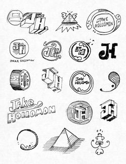
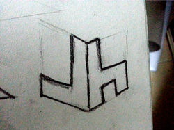
SKETCHES (TUTORIAL 1)
After getting some references to refer, I started to sketch some monograms with my initials which are J and H. Everything turned out well. My lecturer liked some of them and asked me to sketch more based on those she picked.
 |  |  |
|---|---|---|
 |  |  |
 |  |  |
 |  |  |
 |  |  |
 |  |  |
 |  |
 |  |  |
|---|---|---|
 |  |  |
 |  |  |
 |  |  |
 |  |  |
 |  |  |
|---|---|---|
 |  |  |
 |  |  |
 |  |  |
 |  |
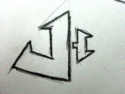
SKETCHES (TUTORIAL 2)
In order to satisfy my lecturer and myself more, I sketched a few more monograms with different designs.
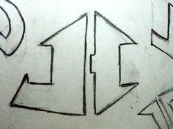
Among all sketches I've done, my lecturer choose this as it is very simple yet significant. In spite of the fact that we really do like this monogram but after using some guidelines on it, I sketched more of it and found out that one of them looks really nice.

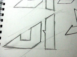
By using 2 parallel lines, I cut out some useless parts and it turns out to be a triable monogram but it somehow looks like an Adidas logo. After my lecturer saw this, she asked me to start sketching on a piece of graph paper with a proper scale.
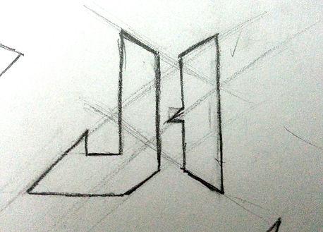
SKETCHES (TUTORIAL 3)
By using the proper scales on graph papers, my monogram turns out really well.


I really really had a hard time on choosing them, both of them look really good and I love them both but I can i only choose one. After hours of thinking and discussing with my lecturer, I decided to choose the 2nd one.
FINAL PRODUCT
Here is the final monogram artwork design digitally using Adobe Photoshop.

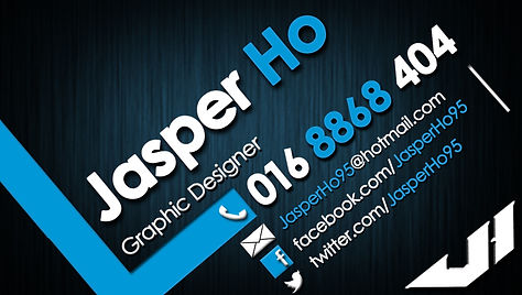
Later on, I added my monogram onto my name card